I knew I wanted to invite Mireya, my usual companion for things World War II-related (we went and saw a documentary about Winston Churchill earlier this year), so as soon as we were able to find a mutually convenient time, we made a date to go see Windows on the War: Soviet TASS Posters at home and Abroad, 1941-1945.
The story behind the exhibit reads a bit like an episode of Antiques Roadshow: museum employees were cleaning out a disused storage closet during the course of a mid-1990s renovation when someone found a pile of paper-wrapped parcels, covered in dust. When they opened them, they discovered hundreds of wartime propaganda posters that had been sent by the Soviet government to arts organizations and other cultural institutions in the United States as "cultural ambassadors" from the besieged nation. Nobody at the Art Institute had ever even opened them, and they sat folded and slowly decaying in their original packaging for over fifty years. After a long conservation and research process, the museum finally opted to create an exhibition around them.
 This drawing demonstrates how the artists behind the Soviet propaganda machine saw themselves: as part of a coalition of writers, artists, and soldiers working together to conquer the Nazi invasion.
The posters were produced by TASS, the state-controlled news agency in the Soviet Union. For each day of Soviet involvement in the war, a different poster was created and hung outside the TASS offices for the citizens to get an update on the progress of the war, along with messages to persevere. The outdoor location for the posters explains their enormous size, and because they hung in the windows of the building, they tend to be long and narrow. Subject matter for the images was drawn from the latest battlefield reports, though the content of each poster had to be cleared by government bureaucrats before it could be mass-produced, so there was a time delay in bringing the officially sanctioned information to the public. After being displayed at the TASS offices, copies of the posters were disseminated across the Soviet Union and shipped to their allies for their own use.

Interestingly, the posters were not created using standard printmaking methods such as lithography or other forms of modern offset printing. Instead, they were created by elaborate sets of stencils, through which the posters were hand-painted one layer at a time. As a result, no two are identical, and each has a unique artistic imprint.
 Apparently, every country had its own version of the "Loose lips sink ships" mantra. The Russian equivalent was "Rumors are the enemy's weapon."
 The theme of this poster was more or less that we reap what we sow. The robust, Social Realist peasant is diligently sowing a field of grain, while the Nazis are spreading nothing but war and destruction.
Windows on the War features 157 TASS posters, along with a variety of earlier Soviet propaganda from the period of the Russian Civil War onward to trace the evolution and influences that came to bear on the later wartime posters, examples of American, British, and Nazi propaganda for comparison purposes, and examples of later Cold War propaganda to demonstrate how quickly American-Soviet relations soured after the war. With the large collection, coupled with all of the supplementary materials, the exhibit is truly daunting in scale. Mireya and I were there for two hours and got kicked out about two-thirds of the way through the exhibit because the museum was about to close. Even after seeing two-thirds of the show, we were both getting visually overwhelmed and suffering from information overload.
 A British propaganda poster, created from a repurposed Soviet image.
Part of the problem with the pacing of the exhibit is the fact that you have to stop and read every single label if you want to understand what the posters are about. Obviously, the writing is all in Cyrillic, so you have to get a translation, plus, the visual language of the posters does not make readily apparent sense to an American audience. The TASS posters draw on events from Russian history, play on Russian folk sayings, and employ symbolism with which we aren't familiar. Other visitors in the exhibit seemed to be focusing on the posters from a graphic design perspective, and were moving through the rooms at a much brisker pace, but if you wanted to understand the historic context and significance of each work, you had to take the time to read.
 A perfect example: this poster was made to commemorate the invasion of Normandy, but draws on the story of St. George slaying the dragon. The knight with his sword at the throat of the demonic representation of Hitler represents the USSR, and the knights in the background bear the flags of Great Britain and the United States.
On the one hand, in this era of edu-tainment, when many museums are reluctant to tackle intellectually rigorous subject matter, I applaud the Art Institute for asking so much of their patrons. On the other hand, I found Windows on the War to be exhausting, and I didn't even see the whole thing. I'm going to have to make a second trip just to finish it, but I do think it'll be worth the time and energy. Given my interest in the former Soviet Union, the exhibit proved fascinating.
 As the Soviet soldiers pressed westward, they discovered the full atrocities of the Nazis, including the concentration camps that were mainly located in Eastern Europe. This poster shows an innocent child, maimed by landmines that a devious Nazi is attaching to children's toys.
I will say that I questioned the layout of the exhibit; I'm not sure they adequately anticipated how visitors would move through the space and planned their exhibits accordingly. Time and again, Mireya and I would discover that we had read the main information panels out of order, which proved disorienting. Furthermore, in an effort to contextualize the pieces, objects were often placed in non-chronological order. The curators might have been trying to show how an artist's experiences creating propaganda or satirical artwork in the pre-war era influenced their wartime work, but the extraneous pieces often proved confusing. At times, it seemed that they were trying to provide too much information, and would have done well to be a bit more judicious in editing the story they were trying to tell.
 This painting was done by an American artist, but I can't for the life of me remember who. Apparently, I missed the "No Photography" sign next to this one, because the man behind me got yelled at by a guard when he tried to follow my lead in photographing it.
Finally, I felt a bit hampered by my inexperience with the Russian language in trying to track all of the artists. I think the curators were trying to show how various artist's styles changed over time, and how they were distinct from one another, but each person's name was so long that I couldn't hold any of them in my mind long enough to be able to recognize them from piece to piece. I'm not sure how they could have remedied that problem, but I do feel like it impeded my ability to fully absorb the lessons of the exhibition.
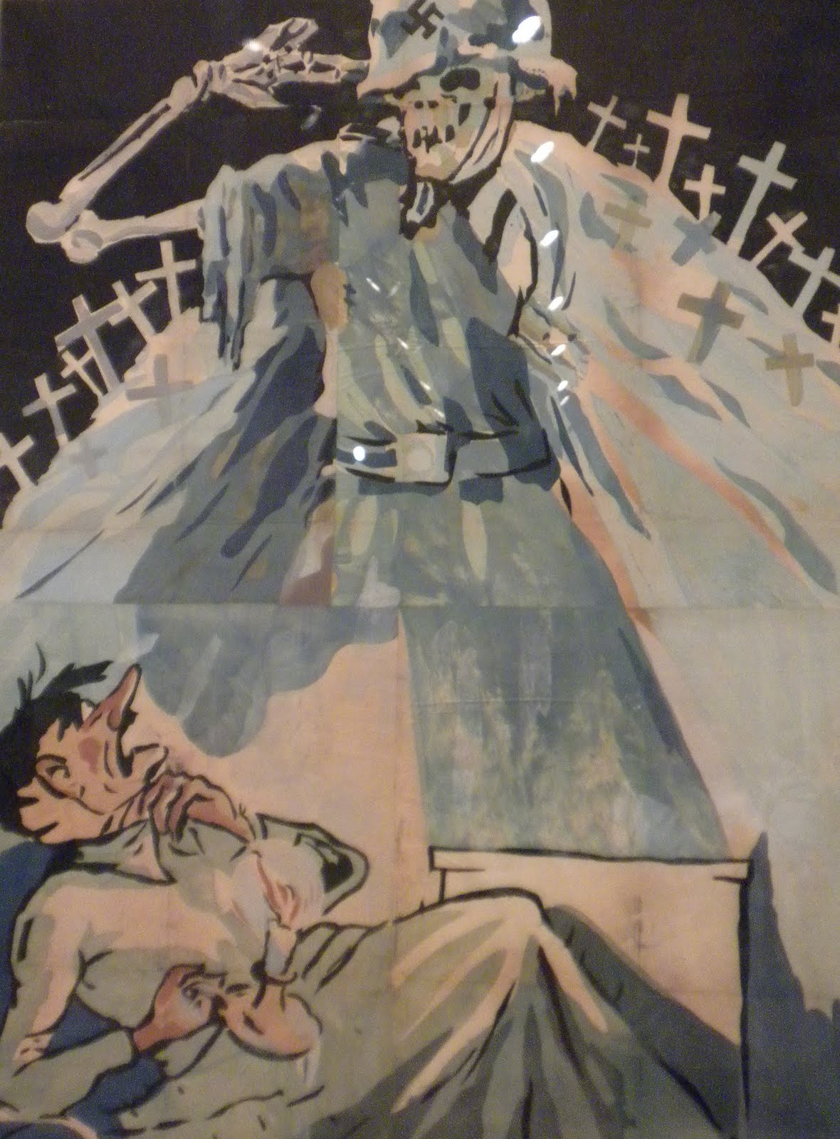 Here, Hitler has a nightmarish vision of all the German soldiers who died under his command.
Still, challenging as it was, and despite the fact that I didn't get to see the whole thing, I think Windows on the War: Soviet TASS Posters at home and Abroad, 1941-1945 was on balance a good exhibit. It was exceptionally informative, and apparently it represents the first ever scholarly investigation of these works in the English language. It's an important show, even if it's a bit ponderous and poorly organized in parts. At worst, I think the curators are guilty of trying to do too much, since they were faced with a more or less blank slate when it came to these pieces. They try to tackle everything at once, and it overloads the viewer with information and images. Still, I'd highly recommend the show to anyone interested in World War II, Russian history, the Cold War, or even simply just graphic design; I'd just budget a minimum of three hours to do it justice...

No comments:
Post a Comment